You're scrolling through listings on a Tuesday night, and the same living room keeps appearing: soft cream walls, one enormous vase, a bouclé sofa that looks like it costs more than your car. Nothing is branded. Nothing is screaming. And yet it all reads as expensive in a way that's hard to put your finger on. That's quiet luxury interior design, and it's the single most imitated look in residential work right now—also the most botched.
Here's what I keep telling clients: quiet luxury interior design is not a palette. It's a set of decisions about what you remove. Most people get the mood board right and the execution wrong, because the essence lives in things you can't photograph well—the thickness of a plaster coat, the weight of a door handle, how light falls at 6pm in November.
Key takeaways
- Quiet luxury is defined by subtraction: fewer objects, better ones, no visible branding.
- What makes it read as expensive is material depth and craftsmanship, not color or furniture count.
- The 3-5-7 rule and the 70/20/10 rule are practical pacing tools, not sacred formulas.
- What's replacing it isn't maximalism exactly—it's warmth, texture layering, and controlled eclecticism.
- Your biggest budget line should be the surfaces you touch and see daily: floors, walls, hardware, upholstery.
What quiet luxury in interior design actually means
The term drifted over from fashion. In clothing, quiet luxury is the cashmere coat with no logo, cut so well that people assume it cost a fortune—because it did. Interiors absorbed the same logic around the time "stealth wealth" entered the vocabulary. The idea: value expressed through material and proportion rather than through recognizable design objects.
Practically, that means a room where nothing announces a brand. No monogrammed cushions. No chair you recognize instantly from a magazine cover. Instead you get materials that hold their own up close—lime plaster, solid oak, unpolished travertine, heavy linen, brushed brass that will patina rather than glitter.
Why it isn't remotely a new idea
Every serious European studio has been building like this for decades. The Milanese, the Belgians, the Danish—none of them needed a hashtag. What's new is the label and the speed at which it traveled from runway to Pinterest. If you've ever stayed in a well-restored farmhouse in Provence or a Vienna apartment from the 1900s, you've already lived inside quiet luxury without anyone calling it that.
The difference between quiet and boring
This is where most projects fail. Quiet luxury requires visible craft to compensate for the absence of visual noise. A plain room with cheap plaster and hollow doors doesn't read as restrained—it reads as unfinished. The tension has to come from somewhere: a deep window reveal, a linen curtain pooling exactly the right amount, a stone sink with a hand-cut edge.
I once specified a budget version of a lime-plaster wall for a client's hallway to save around €3,000. It looked like painted drywall. We redid it six months later in a proper two-coat finish with a wax top, and the entire entryway changed character. That's the whole lesson in one corridor.
The three rules that do the heavy lifting
You'll find these numbers quoted everywhere with slightly different explanations, so let me give you the working versions I actually use on site.
What is the 3-5-7 rule in interior design?
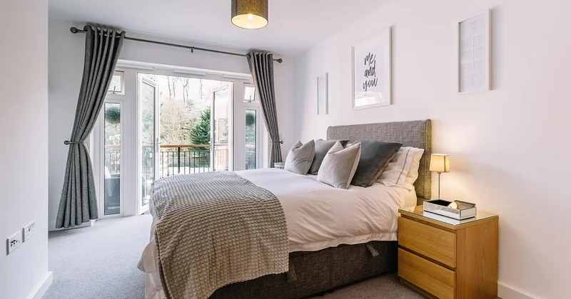
The 3-5-7 rule is a styling guideline for arranging objects in a zone—a shelf, a console, a coffee table. You group items in odd numbers (three, five or seven) because odd counts create asymmetry that the eye reads as natural rather than staged. Within each group you vary height, scale and material: a tall ceramic vessel, a low stack of books, something organic like a branch or a stone.
The rule works because it prevents two failure modes at once: the lonely single object that looks accidental, and the even-numbered symmetry that looks like a hotel lobby. Try three objects on a narrow console and five on a wide one. Seven is for a long sideboard or a deep shelf run. Group them loosely—touching, overlapping, one slightly off-axis.
What is the 70/20/10 rule in design?
The 70/20/10 rule is a color distribution guideline: roughly 70% dominant color, 20% secondary, 10% accent. In a quiet luxury interior the 70% is almost always a warm neutral—chalk, bone, greige, soft sand—because that large calm field is what lets the other elements breathe.
The 20% adds depth without breaking the mood: a mid-tone wood, a darker upholstery fabric, a stone with visible veining. The 10% is your punctuation mark. And this is the part people get wrong: the accent doesn't have to be a color. It can be a single black metal lamp, a bronze door lever, or a piece of dark walnut. One strong note, held back.
How to apply them without becoming a formula
Rules are pacing devices, not laws. I'll say it plainly: if you follow 3-5-7 with religious precision you end up with a room that looks like a styling exercise for a furniture showroom—pleasant, forgettable. Use the odd numbers as a starting point, then break them deliberately in one place. A pair of matching bedside lamps is fine. A pair of matching vases on the same shelf, plus three other objects beside them, is clutter.
Same with color. The 70/20/10 split gives you a calm foundation. But quiet luxury tolerates a fifth tone creeping in—the faded terracotta of a vintage rug, say—as long as the dominant field stays quiet.
Where the money should go
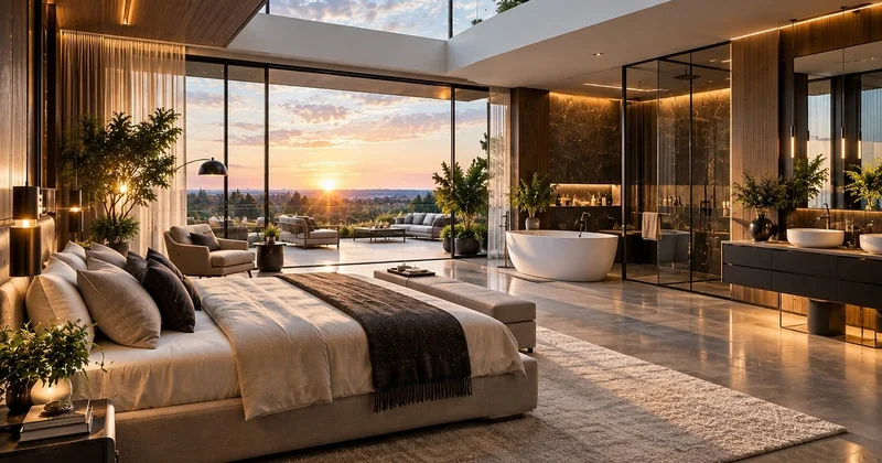
Strip out brand names and quiet luxury is essentially a budget question: you're reallocating spend from recognizable objects to invisible quality. In my experience the split looks like this for a mid-sized living room.
| Element | Typical share of budget | Why it matters here |
|---|---|---|
| Surfaces (plaster, paint, flooring) | 20–25% | They cover the most area and get touched daily |
| Upholstery and textiles | 20–25% | Fabric quality is legible from across the room |
| Joinery and built-ins | 20% | Nothing signals cheap faster than poorly fitted cabinetry |
| Lighting | 10–15% | Layered, dimmable light does more than any accessory |
| Accessories and art | 10% | The smallest line—get this wrong and it's the loudest |
Two things about that table. First, the percentages are a starting ratio, not gospel; a period property with damaged floors will swallow more of the budget before you've chosen a single cushion. Second, notice that accessories sit last. Most people shop in reverse order, buying the vase before fixing the plaster, and then wonder why the room doesn't land.
What is replacing quiet luxury?
Nothing has killed it, but the pendulum is visibly swinging. What's replacing quiet luxury is a warmer, more personal register—sometimes called warm minimalism, sometimes layered eclecticism, sometimes just "lived-in." The direction of travel: more texture, more visible personal history, more tolerance for pattern and color, and a strong appetite for vintage and antiques as a counterweight to all that restraint.
You can see why. A room with nothing extraneous is beautiful for about a year. Then it starts to feel like a hotel suite you happen to pay rent on. People want evidence of a life. So the new iteration keeps the material discipline but loosens the composition: a patterned textile next to the plaster wall, a mismatched chair at the desk, books actually read.
The interesting part is the material continuity
What survives is the underlying requirement for real surfaces. So the successor to quiet luxury isn't maximalism with a hundred objects—it's the same quality threshold with more freedom on top. In practice this means clients still want lime plaster and oak floors, but they now want a kilim and a collected painting in the same room.
How to future-proof your own project
Design so the skeleton stays neutral and the surface layer can change.
- Keep walls and floors in a calm, broad field. They're expensive to redo on a whim.
- Invest in the permanent pieces: sofas, cabinetry, lighting infrastructure.
- Treat textiles and art as the flexible layer—the parts you can swap when your taste shifts.
- Resist buying a whole room at once. Rooms assembled over eighteen months look better than rooms assembled from one showroom visit, and this is not romanticism: you make better choices when you've lived in the space for a season.
A short check before you order anything
Quiet luxury interior design rewards restraint and punishes shortcuts. If you take one thing from this, take the sequencing: fix the surfaces, get the light right, choose a calm dominant field, then add objects slowly and in odd numbers. The look isn't about what you buy. It's about how long you're willing to wait before you buy it.
And when a client asks me whether the trend is over—because they all ask—I usually say the label will fade and the plaster will stay. Which is the point. A room built this way doesn't need to be fashionable. It needs to still feel right in 2036, when nobody is using the phrase at all.