Someone asked me last month why their sofa felt wrong in a room where it technically fit. Everything was there — the sofa, the coffee table, the rug, the TV on the opposite wall. And yet the room felt like a waiting area. I asked one question: how far is the sofa from the TV? Thirty centimetres too far, as it turned out, and angled three degrees off the wall. That was the whole problem.
Furniture arrangement is not decoration. It is measurement plus intent. A living room furniture arrangement guide worth reading should hand you numbers, not moods. So that is what this is: distances you can pace out with your feet, layout patterns that solve specific room shapes, and the old rules (2/3, 3-5-7, the four rules of arrangement) explained honestly, including where they break down.
Key takeaways
- Primary walkways need about 90 cm of clearance; secondary paths can drop to 60 cm.
- The sofa-to-TV distance is a function of screen size, not taste — roughly 1.2 to 2.5 times the diagonal.
- The 2/3 rule, the 3-5-7 rule and the four-rules framework are useful heuristics, not laws of physics.
- Rugs should sit under the front feet of the sofa at minimum. A floating postage-stamp rug shrinks the room.
- Anchor one focal point. Two competing anchors is the most common layout failure I see.
The 90 cm rule nobody tells you about living room furniture arrangement
Circulation comes first. Not the sofa. Not the rug. If people cannot walk through the room without apologising, no amount of cushion styling will save it.
Here is the number that does most of the work: 90 cm. That is the clearance you want on your main path — the line from the doorway to the window, or from the hallway to the kitchen. It is roughly the width of a comfortable stride plus a bit. Below 75 cm, people start turning sideways. Below 60 cm, they stop using the room altogether and take the long way round.
How to measure without a tape measure
Walk the path yourself. If your shoulders brush a chair back or the edge of a console table, the gap is too tight. Most adults need a hair over one arm's length of clearance to pass without adjusting. Secondary routes — between the coffee table and the sofa, for instance — can be tighter, around 45 to 60 cm, because you only need to sidle through there occasionally.
The mistake I made early on, in my own first flat, was pushing everything against the walls to "make the room feel bigger". It did the opposite. The room became a perimeter with a dead zone in the middle, and the walkway from door to window was a slalom. Pulling the sofa 40 cm off the wall and giving the path a clean 95 cm did more for that room than any purchase ever did.
What is the best furniture layout for a living room?
The best layout is the one that matches how the room is actually used, and that answer changes from household to household. There is no universal plan, but there are four patterns that cover the vast majority of rooms. Pick the one whose usage description sounds like your evenings.
| Layout | Best for | Room shape it suits | Watch out for |
|---|---|---|---|
| Symmetrical (facing pair) | Conversation-first rooms, fireplaces | Square or slightly rectangular | Feels formal; poor TV sightlines |
| L-shaped | Family rooms with a TV | Any, especially open plan | The corner can swallow a whole seat |
| U-shaped | Large rooms, entertaining | Wide rectangles | Needs 3+ metres of width or it traps people |
| Parallel (two sofas facing) | Long narrow rooms, dual focal points | Corridors and railway layouts | The gap between them must stay walkable |
Notice what is missing: the "everything against the walls" layout. It is not a layout. It is a default, and it almost always produces the waiting-room feeling I described at the top.
The focal point decision
Every room needs one anchor, and only one. In a room with a fireplace and a TV, you have to choose. My view, and I will defend it: the fireplace wins if it is real and used; the TV wins if it is used daily and the fireplace is decorative. Trying to serve both produces the diagonal sofa, which is a compromise that satisfies neither.
If you genuinely need both, split the room into two zones with a rug and a piece of furniture at the boundary — a low console or a pair of armchairs at ninety degrees. It reads as two rooms sharing a floor, which is honest, rather than one room doing two jobs badly.
Living room furniture arrangement with a TV: the dimensions that matter
Screen distance is the question I get asked most, and it has a real answer. The comfortable viewing band runs from about 1.2 to 2.5 times the screen diagonal. A 55-inch television (about 140 cm across) wants a sofa roughly 1.7 to 3.5 metres away. Closer than that and your eyes track across the image; further and you are squinting at detail you paid for.

Screen height and the eye-line test
Centre of the screen at seated eye level, give or take 15 cm. Sit where you normally sit, look straight ahead. If you have to tilt your chin up, the TV is mounted too high. A wall-mounted screen above a fireplace is the classic offender — fine for a photo, miserable for a two-hour film.
Angles and glare
- Keep the sofa within a 30-degree cone of the screen's centre line where possible.
- Never place the TV directly opposite a bare window unless you enjoy watching your own reflection.
- A slight angle — 5 to 10 degrees — is often more comfortable than a perfect perpendicular and solves glare in one move.
- Leave at least 10 cm behind a wall-mounted screen for ventilation and cables.
The single biggest improvement in my own setup came from moving the sofa 30 cm closer and angling the screen two degrees. Total cost: nothing. Total gain: I stopped noticing the room and started watching the film.
What is the 2/3 rule for living rooms?
The 2/3 rule says a piece of furniture should occupy roughly two-thirds of the wall or surface it sits against. A sofa on an 3.6-metre wall should measure around 2.4 metres, not 1.8 and not 3.5. The same logic applies to a rug under a sofa, a coffee table relative to the seating group, and artwork above a sofa.
Why it works: at two-thirds, the piece reads as belonging to the wall. At half, it looks like it is drifting. At full width, the wall disappears and the room feels stuffed. The rule is a proportion shortcut, and like all shortcuts it needs judgement — a small room can happily break it with a slim sofa, because the goal is visual weight, not literal centimetres.
Applying it to the rug
The rug is where the 2/3 rule earns its keep. At minimum, the front feet of every seat should sit on the rug. Ideally, all feet of the sofa and chairs do. A rug that floats in the middle of the seating group, touching nothing, makes the room look smaller and the furniture look borrowed.
Rough guide: rug width should exceed sofa width by 20 to 40 cm on each side, and the rug should extend at least 60 cm in front of the sofa's front edge so your feet land on it when you sit.
What is the 3-5-7 rule in interior design?
The 3-5-7 rule is a styling guideline for grouping decorative objects: arrange items in odd numbers — three, five or seven — with varying heights, and the composition reads as intentional. It is a rule from interior styling, not from layout planning, and it applies to what sits on a shelf, a mantel or a coffee table.
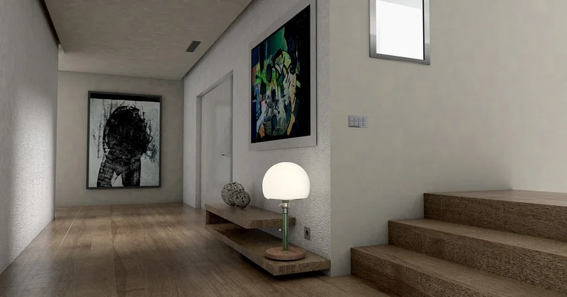
Does it hold up? Mostly, yes, for one unglamorous reason: odd numbers stop the eye from pairing things up and moving on. An even group invites comparison; an odd group invites looking. Vary the heights too — three objects all 20 cm tall is just an even group wearing a disguise.
Where the rule misleads you
It has nothing to say about furniture placement, and people sometimes stretch it there. A room with three sofas is not a good room. Keep 3-5-7 for surfaces, and use proportion and circulation for the floor plan.
What are the four rules in furniture arrangement?
Strip away the styling advice and four principles carry most of the weight. Different sources phrase them differently; here is the version I find most useful in practice.
- One focal point. A single anchor the seating faces. Everything else supports it.
- Conversation distance. Seats no more than about 2.5 metres apart, or people raise their voices and then leave.
- Clear circulation. The 90 cm path, kept sacred. Furniture does not get to block it, however good it looks.
- Balance of visual weight. A heavy sofa against a light chair needs a counterweight — a bookcase, a plant, a floor lamp — or the room tips to one side.
Balance is the one people skip, and it is the one that produces that vague sense of unease. My test: stand in the doorway, half-close your eyes, and look at the room as blocks of tone. If everything heavy is on the left, you will feel it before you can name it.
How to arrange living room furniture in a small space with a TV
Small rooms punish clutter and reward decisiveness. Some specifics that work far better than the usual "use light colours" advice:

- Choose the longest uninterrupted wall and put the TV there. It gives you the straightest sightlines and the most usable floor.
- A sofa against the short wall facing the TV along the long wall wastes less space than a perpendicular arrangement in most narrow rooms.
- Skip the coffee table if the gap between sofa and TV is under 2.5 metres. A pair of small side tables does the job and keeps the walkway open.
- Wall-mount the TV and put a low, shallow console under it — 30 to 35 cm deep, no more. Deep media units eat the room.
- Use a rug that runs almost wall to wall. A small rug in a small room makes it smaller.
A long, narrow room benefits from the parallel layout: two seating groups facing each other across the width, with a clear path down the length. It splits the corridor feel into two usable zones without adding furniture. And a genuinely awkward room — the one with three doors and a radiator — often only needs one decision: which wall is the anchor. Get that right and the rest follows.
Three arrangement mistakes I have made so you do not have to
Buying the rug last. I have done this twice. The rug sets the seating group's boundaries, so choosing it after the furniture means fitting the room around an accident.
Trusting the room's dimensions on paper over its light. A layout that looks perfect on a floor plan can feel wrong because the sofa backs onto the brightest window. Light direction changes how a room is used, and no drawing shows it.
And the one I keep seeing in other people's homes: too much furniture in a room that only needs three pieces. Every extra chair costs circulation. Remove one item and the room usually improves. Try it before you buy anything new — it is the cheapest layout fix there is.
A room works when the measurements are right and the intent is clear. Pace out your walkway. Measure your viewing distance. Pick one anchor. The rest is detail, and detail is much easier to get right once the bones are correct.